Design for the return visit.
Someone revisiting a process may need a reminder rather than a full lesson. A clearly named guide, a short task-focused video or a checklist can make that return visit more useful.
Keep the task within reach.
A resource can be easier to use when its structure follows the task. Put the action in the title. Keep the sequence clear. Show the decision points and give people a practical way to find the next answer.
Think about the environment.
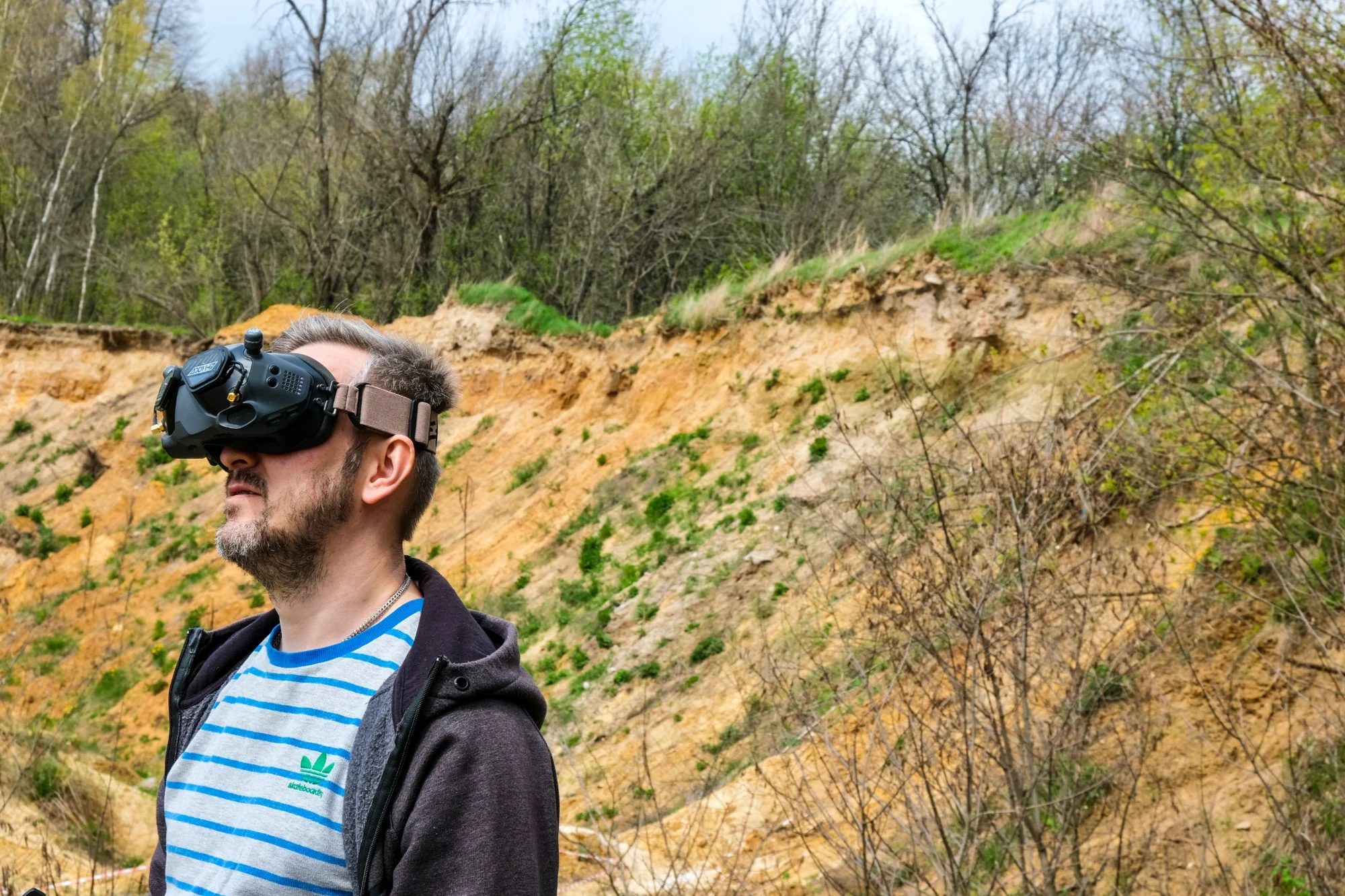
A resource used at a desk has a different context from one opened on a phone in the field. We consider the available time, the screen, the reading conditions and the need for alternatives to audio or visual information.
Make maintenance part of the plan.
Systems and procedures change. Modular content, clear ownership and a review process help keep support resources useful. The work continues beyond the launch date, and the design should make room for that.
Have a learning challenge in mind?
Talk it through with us